
Delivery performance analysis · Logistics
Apex Haul Logistics Command Center
An executive logistics dashboard covering 10,000 deliveries, driver performance and zone analytics.
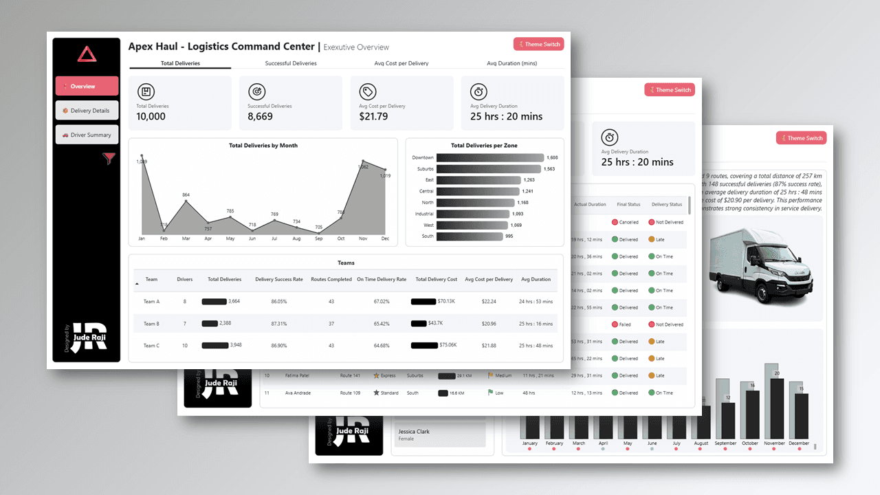
Turn operational chaos into pattern intelligence
I built an executive logistics dashboard for Apex Haul, a fictional logistics company, analysing 10,000 deliveries across multiple routes and two years of operational data (2024 to 2025).
The goal was to turn operational chaos into pattern intelligence.
Why this matters
Logistics runs on tight margins. One bad peak season, a few underperforming routes, driver churn. Any of these can kill profitability. Most companies see these problems too late because their data is scattered across systems and buried in reports no one reads.
This changes that.
How it works
- Executive Overview: high-level KPIs, trends and team performance. Built for C-suite decision-making.
- Driver Performance Summary: individual driver metrics and year-over-year trends. Data-driven performance management.
- Delivery Details: full order-level visibility with status tracking. Operations can find and fix issues fast.
The numbers at a glance
- 10,000 total deliveries, 8,669 of them successful.
- Average cost per delivery of $21.79.
- Average delivery duration of 25 hours 20 minutes.
- Downtown is the busiest zone with 1,608 deliveries, followed by Suburbs with 1,563.
- Three teams and 25 drivers, with volume peaking in November and December.
Tools used
- Power BI for analysis and dashboard creation.
- Python for data generation and modelling.
- Figma for design.
More work
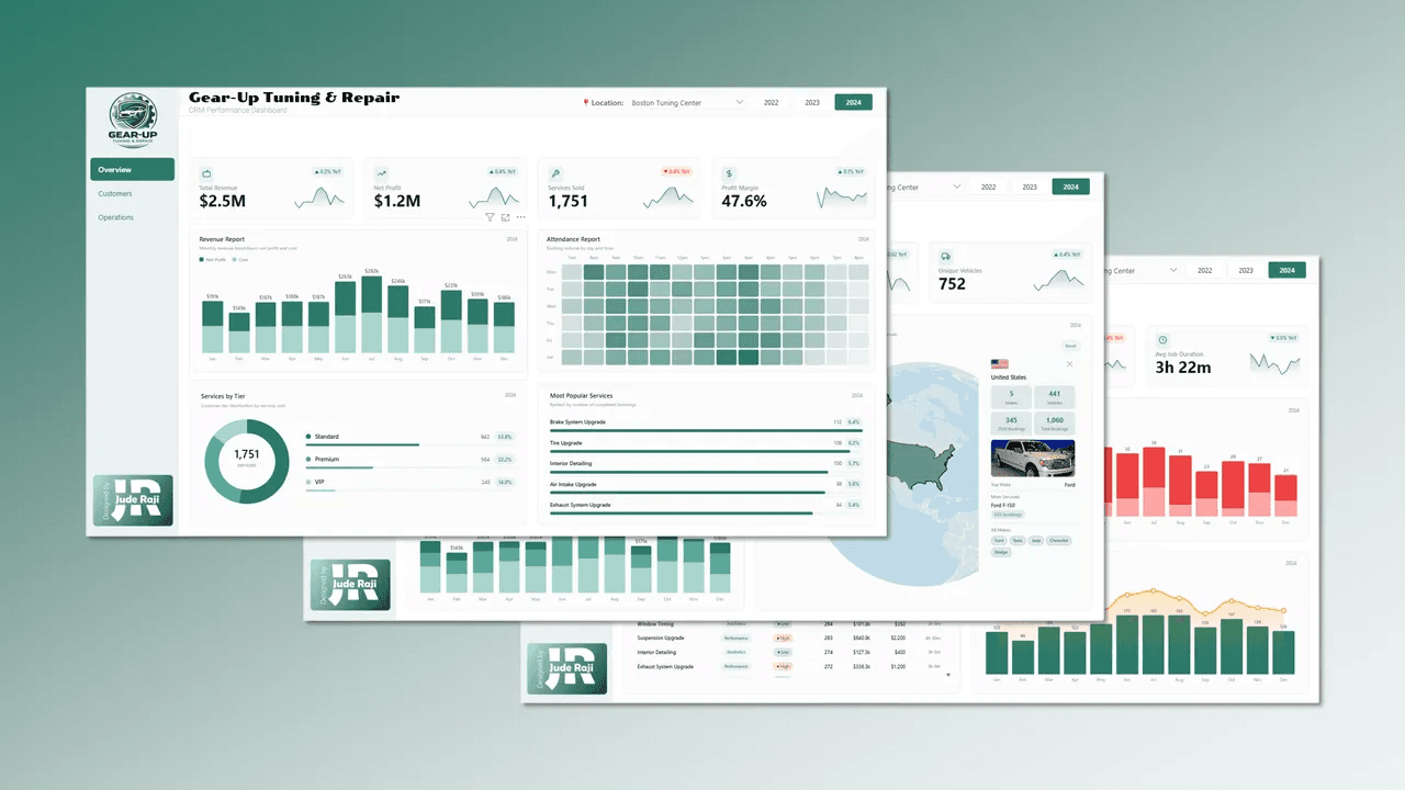
Gear-Up Auto Tuning & Repair
A three-page CRM dashboard covering revenue, customers and workshop operations for a multi-location auto repair business.
Power BI · DAX · HTML5 custom visuals · Figma
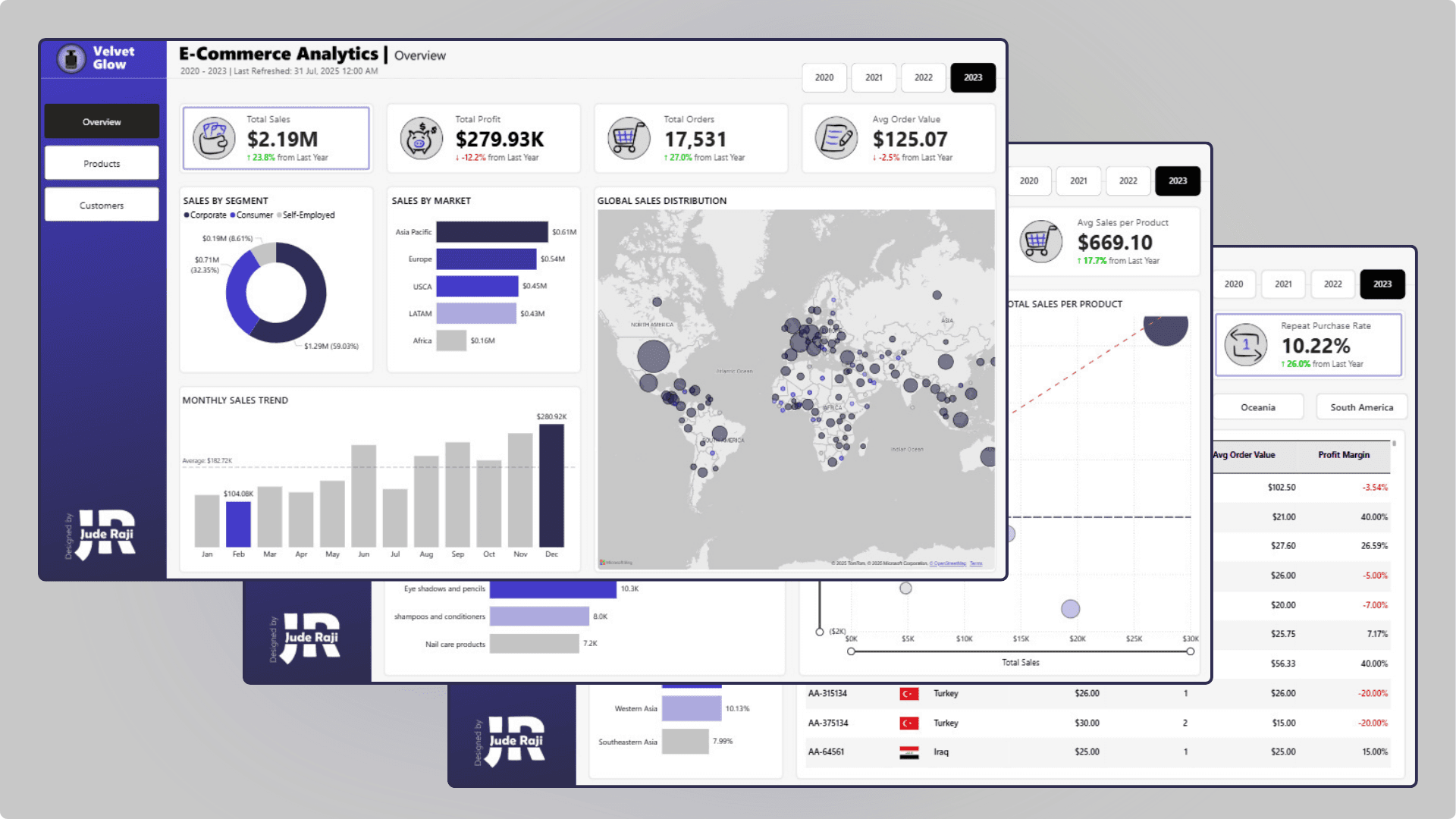
Velvet Glow E-Commerce Analytics
Sales, product and customer analytics for a global skincare and beauty retailer, built to tackle retention and profitability.
Power BI · Excel · Figma
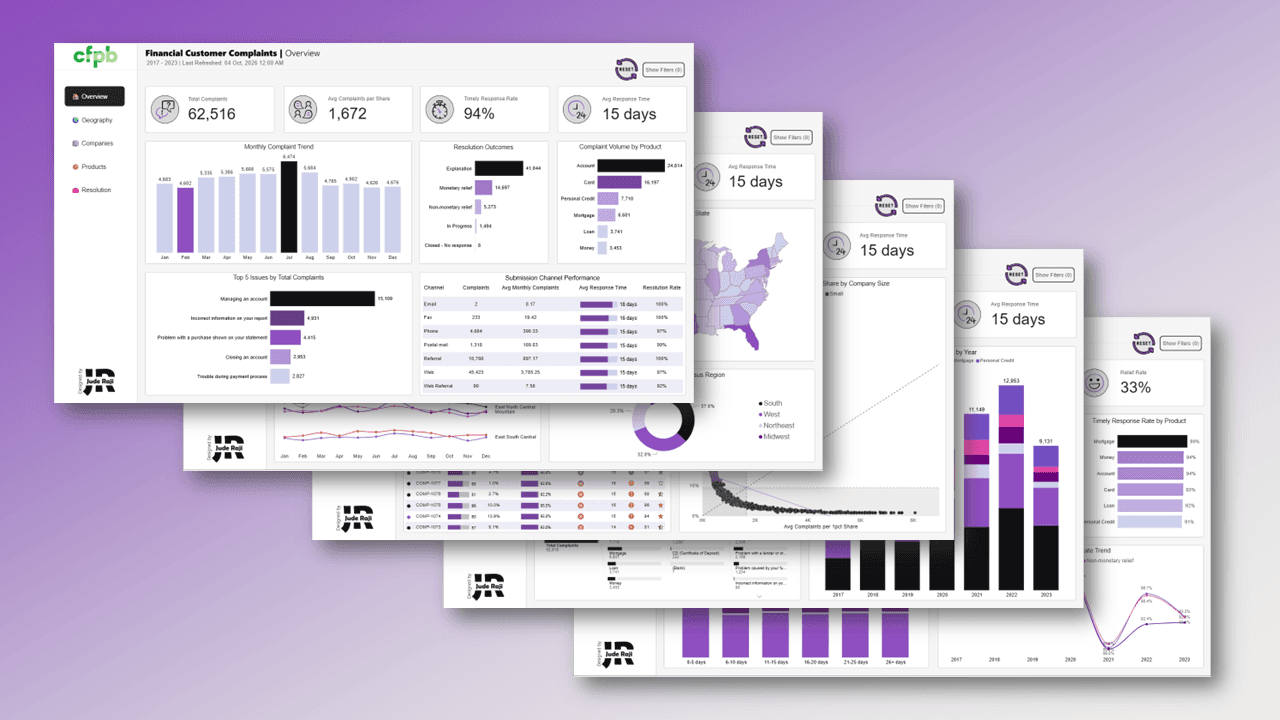
Financial Customer Complaints
Unpacking 62,516 US consumer financial complaints across 320 companies, showing where the system fails everyday customers.
Power BI · Excel · Figma