
CRM analysis · Automotive services
Gear-Up Auto Tuning & Repair
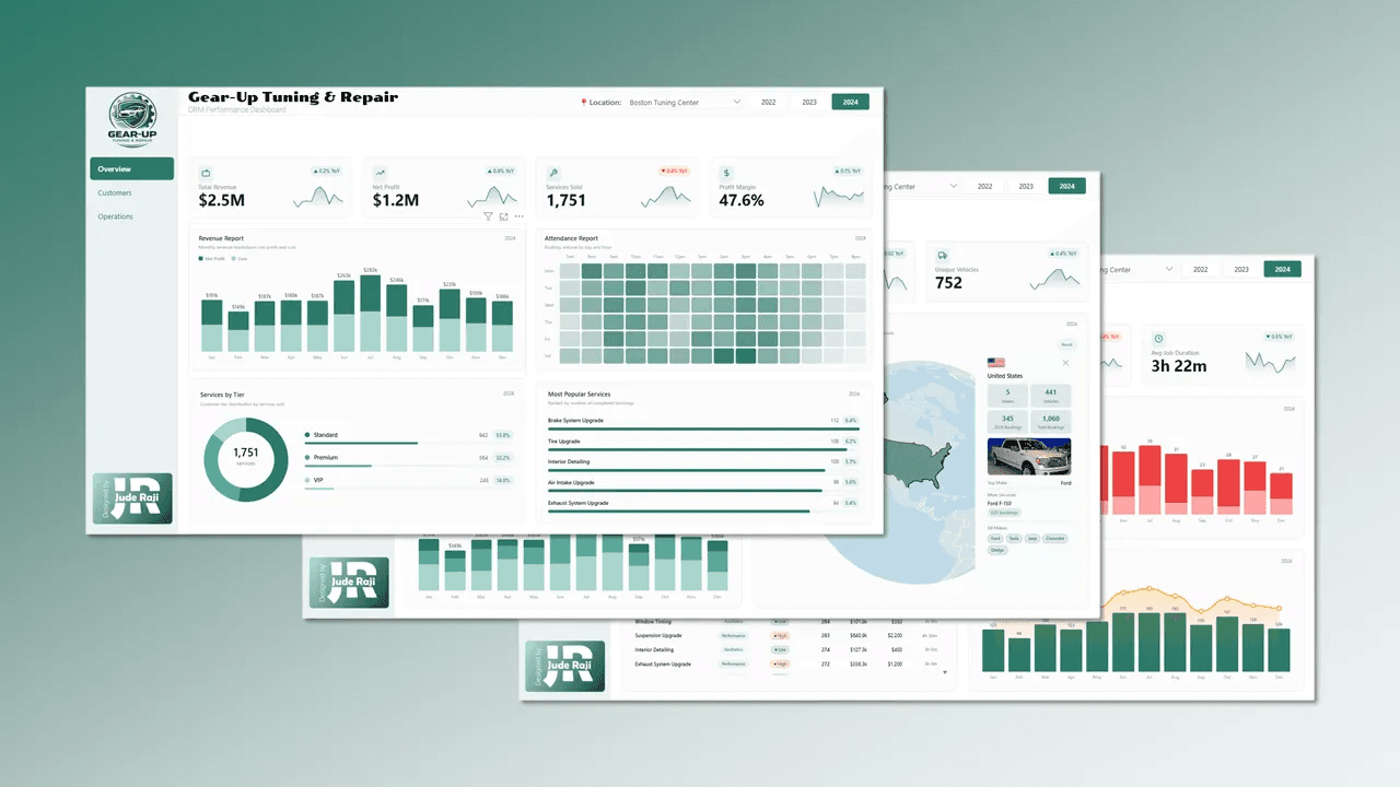
A three-page CRM dashboard covering revenue, customers and workshop operations for a multi-location auto repair business.
Introduction
Gear-Up Auto Tuning is a fictional auto repair company based in Boston, Massachusetts. This project is a three-page interactive CRM dashboard built in Power BI.
What sets it apart technically: almost every visual is rendered through custom HTML, CSS, SVG and JavaScript written inside DAX measures and displayed with the HTML5 Power BI custom visual. That gives design control well beyond the native visuals.
Problem statement
Gear-Up's data was fragmented across bookings, customer records and service logs, with no central view. Leadership needed answers to four questions:
- Which services and customer membership tiers generate the most revenue?
- How are customer satisfaction and repeat purchases trending?
- How is each technician performing over time?
- When do cancellations and no-shows spike?
About the dataset
The dataset covers 2022 to 2024 and is entirely synthetic, spanning Gear-Up's multi-location operations. The model is a star schema that leans snowflake.

Data model
Fact tables
- fact_booking: the central fact table, with booking, customer, date, location, service and technician keys plus cost, discount, duration, price and profit.
- fact_parts_used: parts consumed per booking, with quantity, unit cost and total cost.
Dimension tables
- dim_customer: name, city, acquisition channel, join date, preferred location and tier (Standard, Premium, VIP).
- dim_service: service name, category, complexity, base price and average duration.
- dim_date: the model's date table, with day, month, fiscal period and weekend flag.
- dim_time: hour and period of day, which powers the Attendance Report heatmap.
- dim_vehicle: make, model, colour, engine type, mileage at first visit and car image links, linked through the customer.
- dim_technician: name, specialisation, experience level, hire date and location.
- dim_location: branch name, city, state and capacity.
- dim_parts: part name, category, supplier and unit cost.
All DAX measures live in a dedicated measures table.
The dashboard
Three pages, each answering one question for leadership.
Page 1: Overview

The executive summary: headline revenue and profit, when the workshop is busiest, how bookings split across membership tiers and which services sell most.
Page 2: Customers

Who drives revenue and how satisfied they are: top customers, satisfaction, revenue by tier and where customers' vehicles come from.
Page 3: Operations

How efficiently the work is delivered: service categories, technician performance, cancellations and service-level results.
Insights from the analysis
Key performance indicators


| Area | KPI | Value |
|---|---|---|
| Overview | Total revenue | $22.0M |
| Overview | Net profit | $10.5M |
| Overview | Services sold | 15,350 |
| Overview | Profit margin | 47.5% |
| Customers | Unique customers | 1,800 |
| Customers | Average satisfaction score | 4.1 out of 5 |
| Customers | Unique vehicles | 2,399 |
| Operations | Total bookings | 18,000 |
| Operations | Cancellation rate | 9.7% |
| Operations | Average job duration | 3 hours 25 minutes |
The KPI cards carry sparkline trend lines rendered with HTML and DAX, not the native Power BI KPI visual.
Overview page
1. Revenue Report

a monthly bar chart of net profit and cost across the year. July and August are the strongest months; January and February the weakest.
2. Attendance Report

a calendar-style heatmap of completed bookings by day of week and hour. Activity peaks at 3pm, with 1,579 completed bookings. The core window is 9am to 5pm, with a sharp drop after 6pm.
3. Services by Tier

a donut of completed bookings by membership tier. Standard 8,219 (53.5%), Premium 4,970 (32.4%), VIP 2,161 (14.1%).
4. Most Popular Services

Air Intake Upgrade (814 bookings), Exhaust System Upgrade (813), Suspension Upgrade (804), Tire Upgrade (793) and Window Tinting (791).
Customers page
5. Top 10 Customers

ranked by lifetime revenue, ranging from about $36k to $71k.
6. Satisfaction Overview

a donut of high against low satisfaction (58.5% and 41.5%) with the monthly average score trend. The overall rating is 4.1.
7. Revenue by Customer Tier

a monthly stacked bar chart showing each tier's contribution.
8. Vehicle Origin Mix

an interactive globe of where customers' vehicles come from. Clicking a country opens a card with the vehicle count, top make and model, and a photo.
Operations page
9. Services by Category
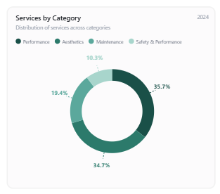
Performance 35.5%, Safety & Performance 34.8%, Maintenance 19.4%, Aesthetics 10.3%.
10. Technician Leaderboard

each technician's revenue with an inline sparkline of monthly performance, built from a single DAX measure using HTML, CSS and SVG. Katherine Parsons leads at $1,004k.
11. Cancellations and No-Shows

a monthly chart of dropouts, peaking from May to July alongside the busiest booking period. Every dropout is a cancellation; there are no no-shows.
12. Service Performance Table

category, colour-coded complexity, completions, revenue, price and average duration for every service. Suspension Upgrade earns the most, at $1,811.2k from 804 completions at a $2,200 price point.
13. Monthly Services and Revenue

completed services as bars with revenue as a line. The two track closely, peaking mid-year.
Summary of insights
- Growth has stalled. Revenue slipped from $7.12M in 2022 to $7.09M in 2023 and $7.08M in 2024, and net profit followed. Margins held steady, so the business is stable but not expanding.
- VIP customers are worth more. Average profit per VIP booking rose from $767 in 2022 to $788 in 2024, while Standard fell from $650 to $628. VIP delivers 25% more profit per booking, on only 708 to 737 bookings a year. Growing that segment is the clearest lever.
- Satisfaction is eroding. High-satisfaction bookings fell from 60.0% in 2022 to 57.6% in 2024. For a business that depends on repeat customers, that direction needs attention.
- The repeat rate is flat. The loyal base is strong, but with no improvement year to year, retention alone will not drive growth.
- Cancellations did not improve for long. The rate was 10.0% in 2022, 9.2% in 2023, then back to 10.0% in 2024. Recovering even part of those bookings would restore meaningful revenue.
- Demand is spread across the catalogue. The top service changes every year: Suspension Upgrade in 2022, Carbon Fibre Wrap in 2023, Exhaust System Upgrade in 2024.
Recommendations
Protect the VIP segment
Dedicated booking windows, the same technician each visit and exclusive service tiers, with a clear upgrade path from Premium.
Find the root cause of low satisfaction
The 41.5% low-satisfaction share is too high. Tie post-service feedback to the satisfaction score to surface causes before customers leave.
Coach technicians on trends
Use the leaderboard sparklines to spot declining trajectories, not only current rank.
Cut cancellations in peak periods
Automated reminders 48 and 24 hours before a booking, and a small deposit on high-complexity, high-value services such as Suspension Upgrades.
Bundle services
Pair Suspension Upgrade with Air Intake Upgrade for performance-focused customers to raise average booking value.
Conclusion
Gear-Up's data tells a story of strong customer loyalty, healthy margins and capable technicians, set against real opportunities in satisfaction, peak-period capacity and high-value bundling.
The dashboard itself shows what is possible when DAX is used as a templating engine for HTML, CSS, SVG and JavaScript. The three pages follow one arc: Overview covers headline performance, Customers shows who drives revenue and how satisfied they are, and Operations shows how efficiently the work is delivered.
Tools used
- Power BI for data modelling, DAX development and report building.
- HTML, CSS, SVG and JavaScript for custom visuals, rendered through the HTML5 Power BI visual.
- Figma for the background canvas and layout.
More work
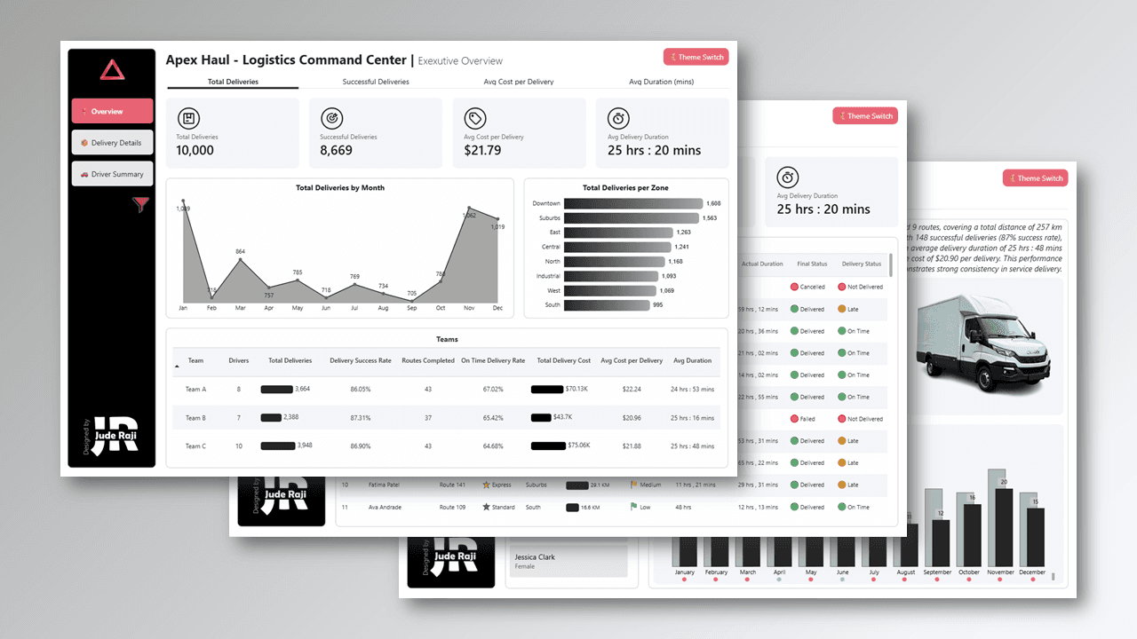
Apex Haul Logistics Command Center
An executive logistics dashboard covering 10,000 deliveries, driver performance and zone analytics.
Power BI · Python · Figma
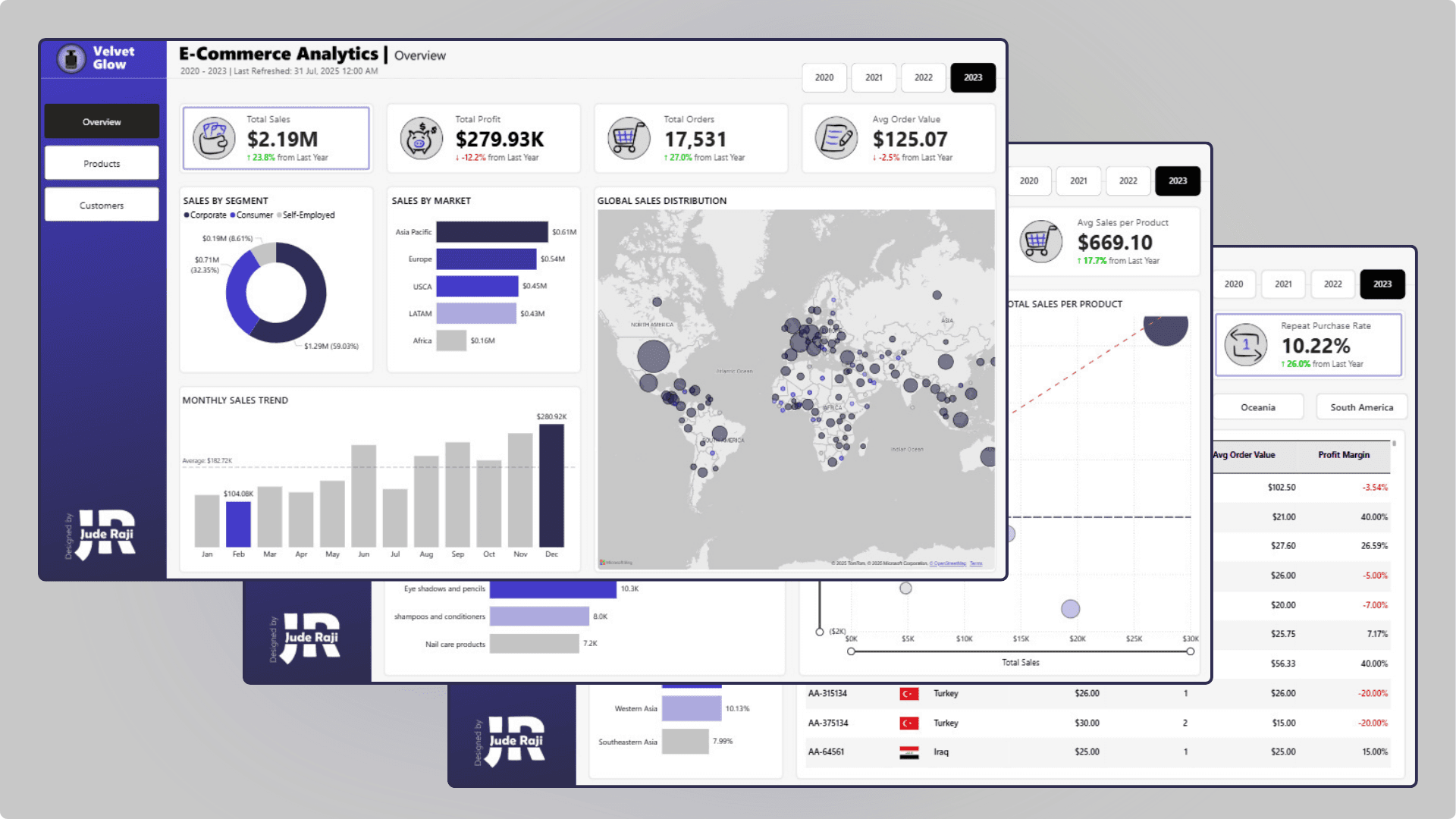
Velvet Glow E-Commerce Analytics
Sales, product and customer analytics for a global skincare and beauty retailer, built to tackle retention and profitability.
Power BI · Excel · Figma
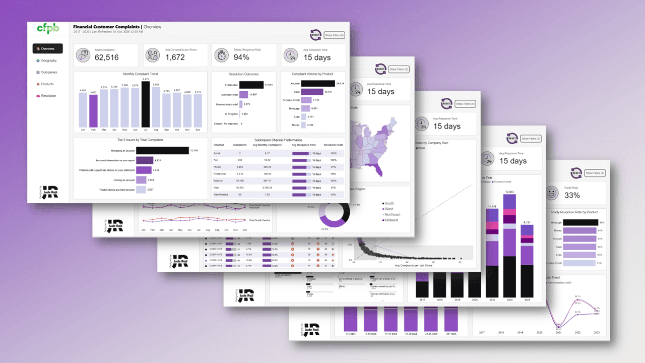
Financial Customer Complaints
Unpacking 62,516 US consumer financial complaints across 320 companies, showing where the system fails everyday customers.
Power BI · Excel · Figma